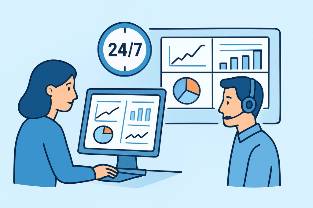
Building a NOC that actually works around the clock means designing for the 3am shift, not the 10am demo – that’s the piece most teams get backwards when they build a NOC dashboard. A network operations center dashboard has to surface the handful of signals that matter, route the right alert to the right person, and stay legible to someone who’s been staring at screens for six hours straight.
The mistake shows up constantly: a team builds a beautiful Grafana wall with 40 panels, ships it, and within three weeks nobody looks at it because half the graphs are noise and the other half require tribal knowledge to interpret. A NOC dashboard isn’t a data visualization exercise. It’s an operational tool that has to survive shift handoffs, on-call fatigue, and the 2am page where nobody has patience for a cluttered screen.
What a NOC dashboard actually needs to show
Start with the failure domains, not the metrics. A NOC covering a 200-server, 40-switch environment across three data centers doesn’t need per-process CPU graphs on the main wall – that’s for the drill-down screen. The top-level view needs four things: service availability (is the thing customers use actually up), infrastructure health at the aggregate level (how many hosts are degraded right now, not their individual trend lines), active incidents with severity and age, and network path status between sites.
A good rule of thumb from teams running 24/7 NOCs: if a panel doesn’t answer “do we need to act right now” within two seconds of looking at it, it belongs on a secondary screen, not the main wall. The main NOC display is a triage tool, not a reporting tool.
Uptime monitoring and port/SSL checks belong here too, since external monitoring catches the class of failure that internal metrics miss entirely – a service can look healthy from inside while being unreachable from the internet because of a firewall rule change or a routing issue upstream.
Structuring the display for shift work
A NOC dashboard that runs 24/7 gets watched by different people at different alertness levels. The overnight shift at 3am is running on less attention than the day shift at 10am, so the design has to compensate rather than assume equal vigilance.
Three practical rules that hold up in real deployments:
Color discipline – red means “act now,” yellow means “watch,” green means “fine.” If a panel uses orange, blue, and five shades of red for different severities, the on-call engineer at hour 10 of a night shift will misread it. Stick to three states wherever possible.
Fixed layout, no auto-rotation on the primary wall – rotating dashboards look impressive in a sales demo and are actively dangerous in production, because an incident can appear and disappear from view while the screen is showing an unrelated panel. Rotation is fine for a secondary informational screen, never for the incident-detection wall.
Aggregate first, drill-down second – the primary screen shows counts and status (“3 hosts degraded in DC-East”), and clicking through gets the per-host detail. This is the same principle behind good server health dashboards, just applied at NOC scale across an entire environment instead of one box.
Building the alerting layer underneath the dashboard
The dashboard is the visible layer, but it’s worthless without the alerting logic behind it. A dashboard alone means someone has to be staring at it to catch a problem, which defeats the point of 24/7 coverage – NOCs exist because humans can’t watch a screen at 100% attention for 12 hours, so alerts have to do the actual catching.
Set up escalation paths before the dashboard goes live: a database connection pool exhaustion event on a production Postgres cluster shouldn’t sit as a yellow tile for 20 minutes waiting for someone to notice it – it should page the on-call DBA directly. Teams that skip this step end up with a “pretty but passive” NOC, where the wall looks operational but the actual incident response still depends on someone happening to glance at the right panel at the right moment. Structuring automated alert escalation so severity maps to notification channel (Slack for warnings, phone call for critical service-down events) is what turns the dashboard from a display into an operations tool.
This is also where alert fatigue kills NOCs from the inside. A wall that fires 200 notifications a shift trains operators to ignore notifications altogether, which is worse than having no alerting at all – it’s the boy-who-cried-wolf problem at infrastructure scale. Tuning thresholds so a page actually means something is worth more engineering time than any dashboard redesign; the practices covered in reducing alert fatigue with smarter thresholds apply directly here.
Common mistakes teams make building NOC dashboards
Three patterns show up repeatedly in NOCs that don’t hold up under real incident load.
The first is building the dashboard around whatever metrics were easiest to collect rather than what matters operationally. A team monitoring 15 web servers put raw CPU percentage front and center because it was the first metric their agent exposed, while ignoring queue depth on their message broker – which was the actual leading indicator of the outages they kept having.
The second is trusting a single data source without cross-checking. A host reporting “healthy” via its local agent can still be unreachable from the outside if a switch port failed or a firewall rule got pushed incorrectly. This is why external and internal monitoring need to run side by side – agent-based metrics tell you what’s happening inside the box, external checks tell you what the rest of the world actually experiences.
The third is measuring uptime instead of measuring the thing that matters to the business. A service can be “up” (process running, port open) while returning 500 errors on every real transaction. Health checks that only verify a process is alive miss this category of failure completely, which is exactly the myth worth busting here: uptime percentage is not the same thing as service health, and NOCs that only track the former get blindsided by the latter constantly.
Sizing the dashboard to the team
A five-person IT shop covering off-hours with a rotating pager doesn’t need the same NOC build as an MSP running 24/7 coverage for 30 clients. For a small team, a single consolidated view with SLA status and critical process monitoring is enough – SLA tracking and reporting gives that team the after-the-fact accountability layer without needing a dedicated ops center.
For an MSP or larger IT department running an actual staffed NOC, the dashboard needs per-client or per-site segmentation, because a single wall showing 30 clients’ infrastructure blended together is unreadable during an actual incident. Multi-tenant separation, even if it’s just filterable views on the same underlying data, is what keeps the wall usable once headcount and infrastructure scale past what one person can hold in their head.
Frequently asked questions
How many screens does a NOC need?
Most functioning NOCs run two to three: a primary incident wall showing aggregate status and active alerts, a secondary screen for network topology or SLA trends, and sometimes a third for security/firewall events if that’s monitored separately. More than three screens usually means the information architecture needs work, not that more space is needed.
Should a NOC dashboard refresh in real time or on a delay?
Real time for anything actionable – service status, active incidents, network path health. A 30-60 second refresh is fine for trend panels like bandwidth utilization or capacity graphs, since those don’t need sub-second precision and a faster refresh just adds visual noise from normal fluctuation.
What’s the biggest difference between a NOC dashboard and a regular monitoring dashboard?
A NOC dashboard is designed for continuous passive observation by rotating shifts of people who may not be infrastructure experts, so it has to be self-explanatory and triage-oriented. A regular monitoring dashboard, used by an engineer actively investigating something, can afford more density and assume more context.
A NOC dashboard earns its keep the first time it catches something at 4am that would otherwise have waited for a customer complaint at 9am. Build it around failure domains and escalation paths first, decorate it with graphs second, and revisit the panel layout every few months as the infrastructure and the team’s blind spots change.