A server health dashboard is the first thing you check in the morning and the last thing you glance at before leaving the office – or at least it should be. If you’re a sysadmin, DevOps engineer, or MSP running dozens of servers, you need a single screen that tells you whether everything is fine or something needs attention right now. This article covers the essential metrics every server health dashboard should display and how to set one up without drowning in data.
The difference between a useful dashboard and a useless one is brutal. A good dashboard saves you from 3 AM phone calls. A bad one is just a fancy screensaver that nobody trusts.
Why Most Server Dashboards Fail
Here’s a myth that refuses to die: more data on screen means better monitoring. It doesn’t. I’ve seen dashboards with 40+ panels crammed into a single view – CPU graphs for every core, network packets per interface, swap usage broken down by process. Nobody reads them. When everything is on screen, nothing stands out, and the whole point of a dashboard is that problems stand out instantly.
The best server health dashboards follow a simple rule: if you can’t tell whether something is wrong within five seconds, the dashboard needs work. You want a view that answers one question – “Is everything okay right now?” – and then lets you drill down when the answer is no.
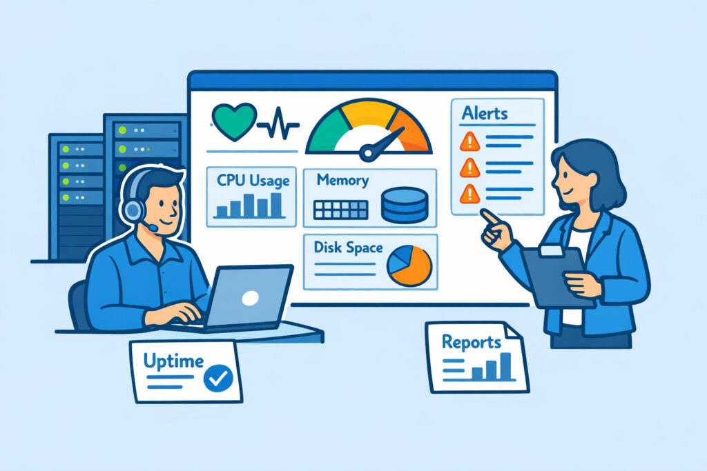
The Five Essential Metrics for Any Server Health Dashboard
Every server environment is different, but these five metrics belong on virtually every health dashboard. Skip any one of them and you’re flying partially blind.
1. CPU utilization. Not just the average – you want to see current load and a short trend line (last 30–60 minutes). A server sitting at 85% CPU isn’t necessarily a problem if it’s a batch job that finishes in ten minutes. A server that’s been climbing from 40% to 78% over six hours is a different story. Context matters, and trend lines provide it.
2. Memory usage. Watch both used and available memory, not just the percentage. Linux is notorious for confusing people here – buffers and cache make “used” memory look higher than it really is. Your dashboard should show actual application memory consumption. When free memory drops below your threshold, you need to know before the OOM killer starts making decisions for you.
3. Disk space and I/O. Disk full is still one of the most common causes of outages, and it’s entirely preventable. Display both current usage percentage and the rate of change. A disk at 70% that’s growing 2% per day gives you a two-week window. A disk at 70% growing 5% per hour means you have a problem right now. If you want a deeper guide on tracking these three together, check out how to monitor CPU, memory, and disk space in real time.
4. Network throughput and errors. Bandwidth usage alone isn’t enough. You want to see packet errors, dropped packets, and latency. A server can have plenty of bandwidth available and still perform terribly if packet loss is climbing. This is especially true for database servers and anything handling real-time traffic.
5. Service and process status. Is your web server running? Is the database accepting connections? Is that critical background worker still alive? A dashboard that shows green hardware metrics while your main application process crashed ten minutes ago is worse than no dashboard at all. Service-level checks close the gap between “the server is up” and “the thing we care about is actually working.”
Structuring the Dashboard for Real Use
Put the most critical information at the top left – that’s where eyes go first. Use a traffic-light pattern: green for healthy, yellow for warning, red for critical. Avoid using more than three or four colors. If your dashboard looks like a Christmas tree, it’s not helping anyone.
Group metrics by server or by function, depending on your environment. If you manage 20 servers that all do the same thing (like a web farm), group by metric – show all CPU readings together so you can spot the outlier. If your servers have distinct roles (database, application, cache, mail), group by server so you see each machine’s full picture.
For environments with many servers, a multi-server dashboard that aggregates status into a single overview is essential. You shouldn’t need to click through 15 tabs to know if your infrastructure is healthy.
Alerts: The Dashboard’s Safety Net
A dashboard only works when someone is looking at it. For the other 16 hours of the day – and weekends, holidays, and lunch breaks – you need real-time alerts backing up your visual monitoring.
Set thresholds that reflect reality, not paranoia. CPU at 80% for 30 seconds? Probably fine. CPU at 80% for 15 minutes straight? Worth an alert. Memory at 90%? Depends on your application. The worst thing you can do is set aggressive thresholds that flood your inbox. Alert fatigue is real, and it leads to people ignoring the one alert that actually matters.
A good practice: start with generous thresholds and tighten them over two to four weeks as you learn your servers’ normal behavior patterns. Every environment has a different “normal.”
Going Beyond Default Views
Once you have the essentials covered, custom dashboards let you build views tailored to specific roles or situations. Your NOC team needs a high-level overview. Your DBA needs database-specific panels. Your DevOps lead might want a deployment-correlated view that shows metrics alongside recent releases.
The key is layering: one top-level health dashboard for the quick daily check, then specialized dashboards for investigation and deep dives. Don’t try to cram everything into one screen.
FAQ
How often should a server health dashboard refresh?
For most environments, a 30–60 second refresh interval gives you near-real-time visibility without hammering your monitoring system. If you’re running latency-sensitive applications or high-frequency trading infrastructure, you might push that down to 10–15 seconds – but for typical web servers, databases, and application servers, once a minute is plenty.
What’s the minimum number of servers where a dashboard becomes necessary?
Even with a single production server, a dashboard saves you time compared to SSH-ing in and running htop manually. But the real payoff starts around three to five servers, where keeping mental track of everything becomes unreliable. By the time you hit ten or more, a centralized dashboard isn’t optional – it’s survival.
Should I build my own dashboard or use a monitoring platform?
Building custom dashboards with Grafana or similar tools gives you maximum flexibility, but it also means maintaining the data pipeline, storage, and visualization layer yourself. A platform like NetworkVigil gives you a ready-made dashboard with agent-based metrics out of the box – install the agent, and your essential metrics appear automatically. For most teams, starting with a platform and customizing from there is faster than building from scratch.
A server health dashboard isn’t a nice-to-have – it’s your first line of defense. Get the five essential metrics on screen, set sensible alerts behind them, and resist the urge to overload the view. The best dashboard is the one your team actually looks at every day.